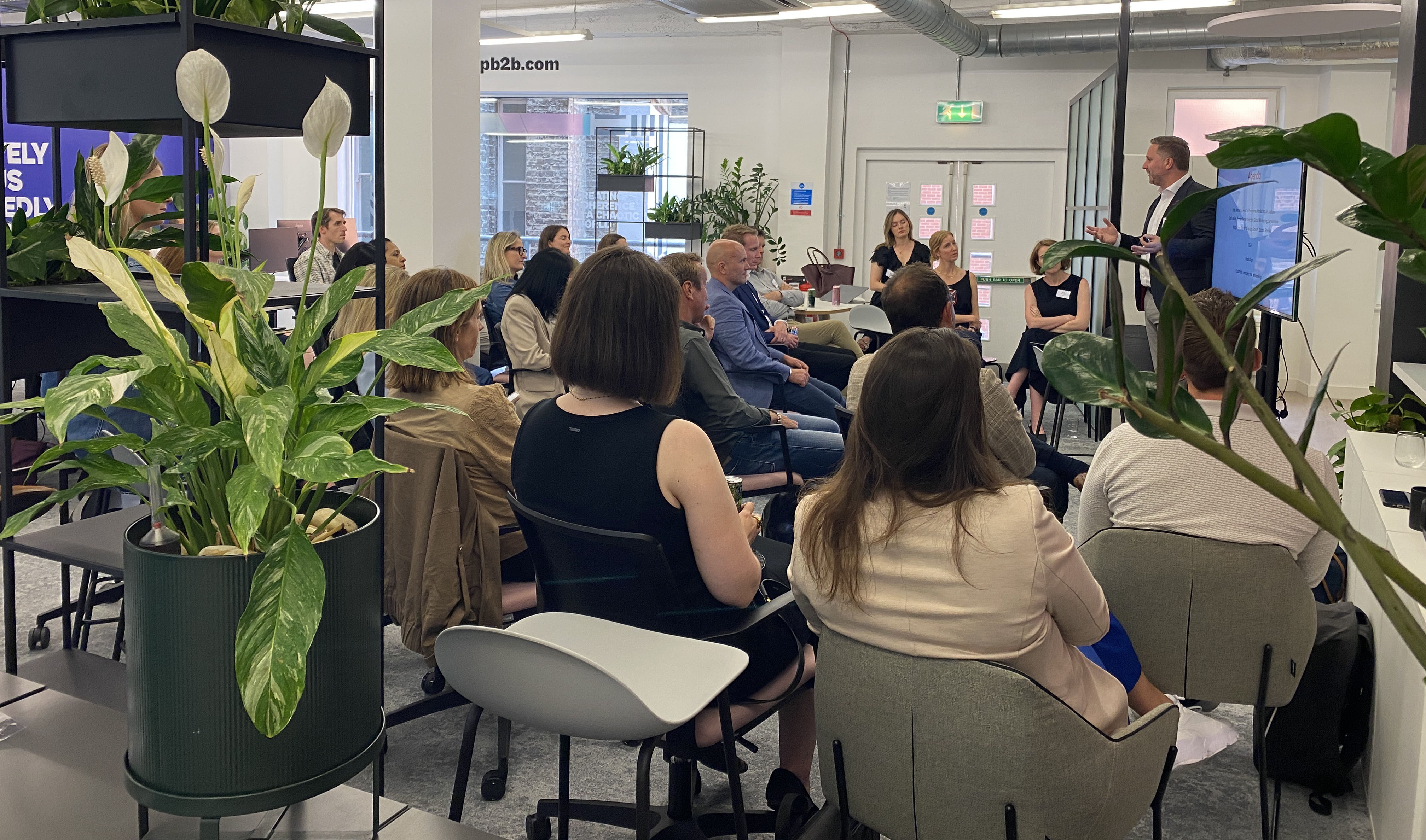
The SEO platform needed to position themselves as the partner that spurs growth. But first, they had to stand out from the crowd…
Did you know that only half of enterprise web pages are crawled by search engines? This huge untapped opportunity is where Botify gives CMOs a competitive edge over their rivals. However, in an industry where many SEO brands are mirror images of each other, Botify needed a look and feel that separated them from the pack, one that truly showed them as the technological leader that they are.
After in-depth strategy sessions with Botify where we got to know the founders, key stakeholders and their ambitions, we developed the core idea of ‘unlocking hidden potential’. The aim is to target the C-suite audience by being simpler, clearer and bolder. Every element of the brand, from the typefaces to the colour palette to the new logo, was designed to break away from the tired and clichéd design cues of Silicon Valley startups.
The new brand
The result is an impactful new logo with a subtle magnifying glass in the O – the universal icon for online search. In animation, the O can spin to mimic the action of radar systems finding and tracking objects.
![]()
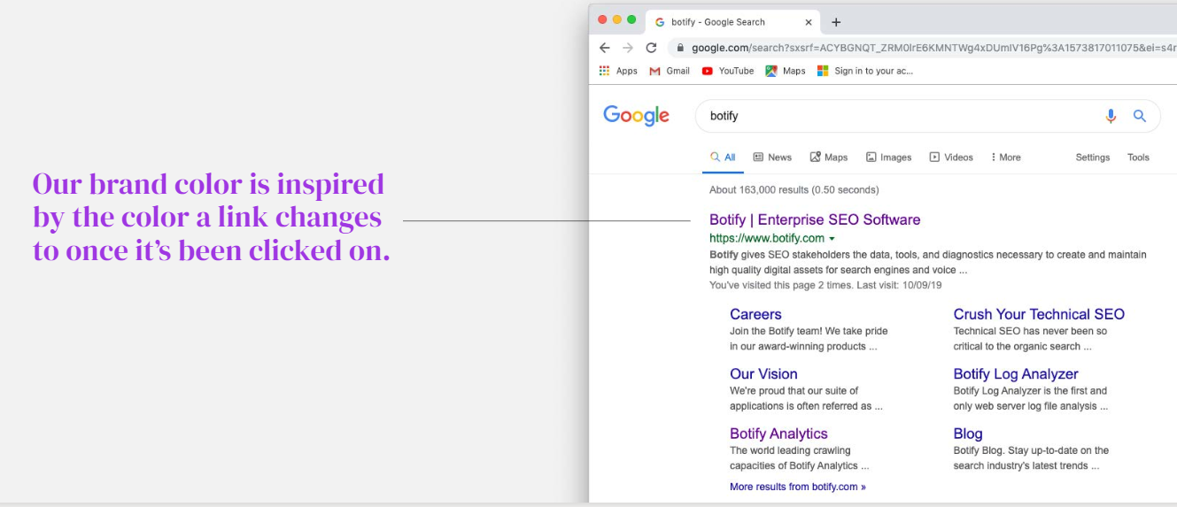
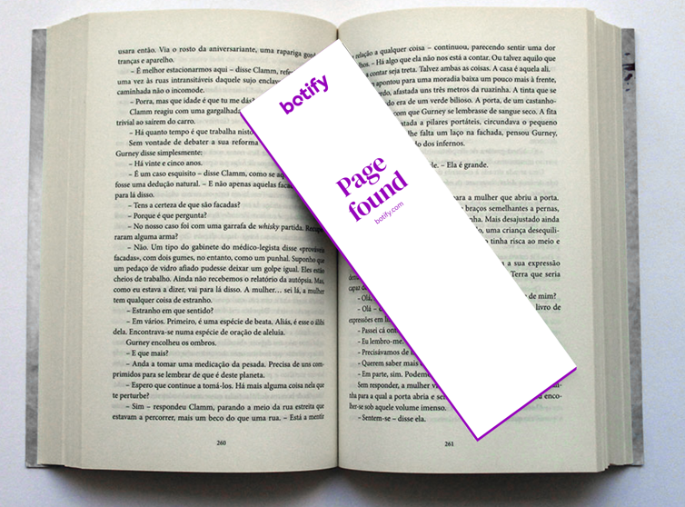
And we chose the colour purple for two reasons. Firstly, it is completely ownable as all their competitors have almost exclusively opted for blue and green hues. Secondly, purple is the colour once a link has been clicked on during a web search. Each of these little touches embeds the concept of search into the Botify brand and tells its own interesting story.
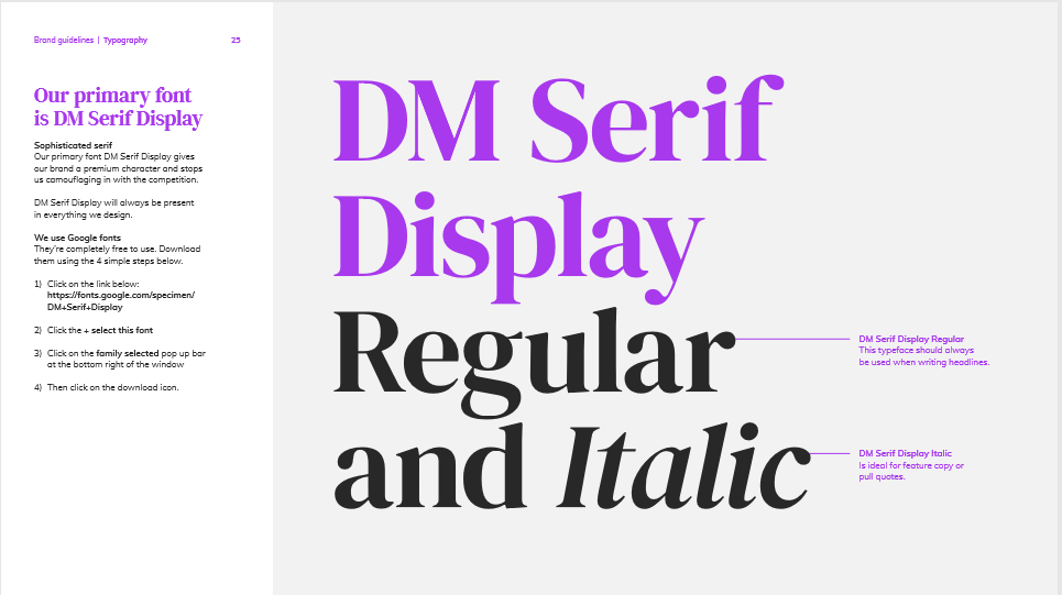
As well as the logo, we also needed a typeface that stood out. We used a bold serif typeface, DM Serif, to a give a more editorial feel and reflect the important and informative things the brand had to say.
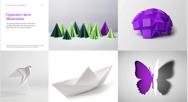
Leaving a paper trail
To add depth to our communications, we used the semiotics of paper as our core imagery device. Paper embodies the simplicity of the brand but it’s also a powerful metaphor for information and knowledge, as well as craft and quality. By using folded, layered and cut-paper illustrations, we also gave the brand a tangible, real look and feel that’s a million miles away from the identikit graphic illustrations of their competitors.
Working with Botify was a real delight and we’re ecstatic how the brand turned out. We believe they now have the look and identity that truly ranks above their SEO rivals.